


Poggi Design
Where beauty & luxury meet function

Problem vs Solution
Poggi Design was already an established and successful interior design studio with years of accomplishments under its belt. Their original brand, simple and straightforward, perfectly reflected the founder’s persona. However, after years in the market, they felt it was time to elevate their brand presence—creating something that felt even more authentic and aligned with their evolution.
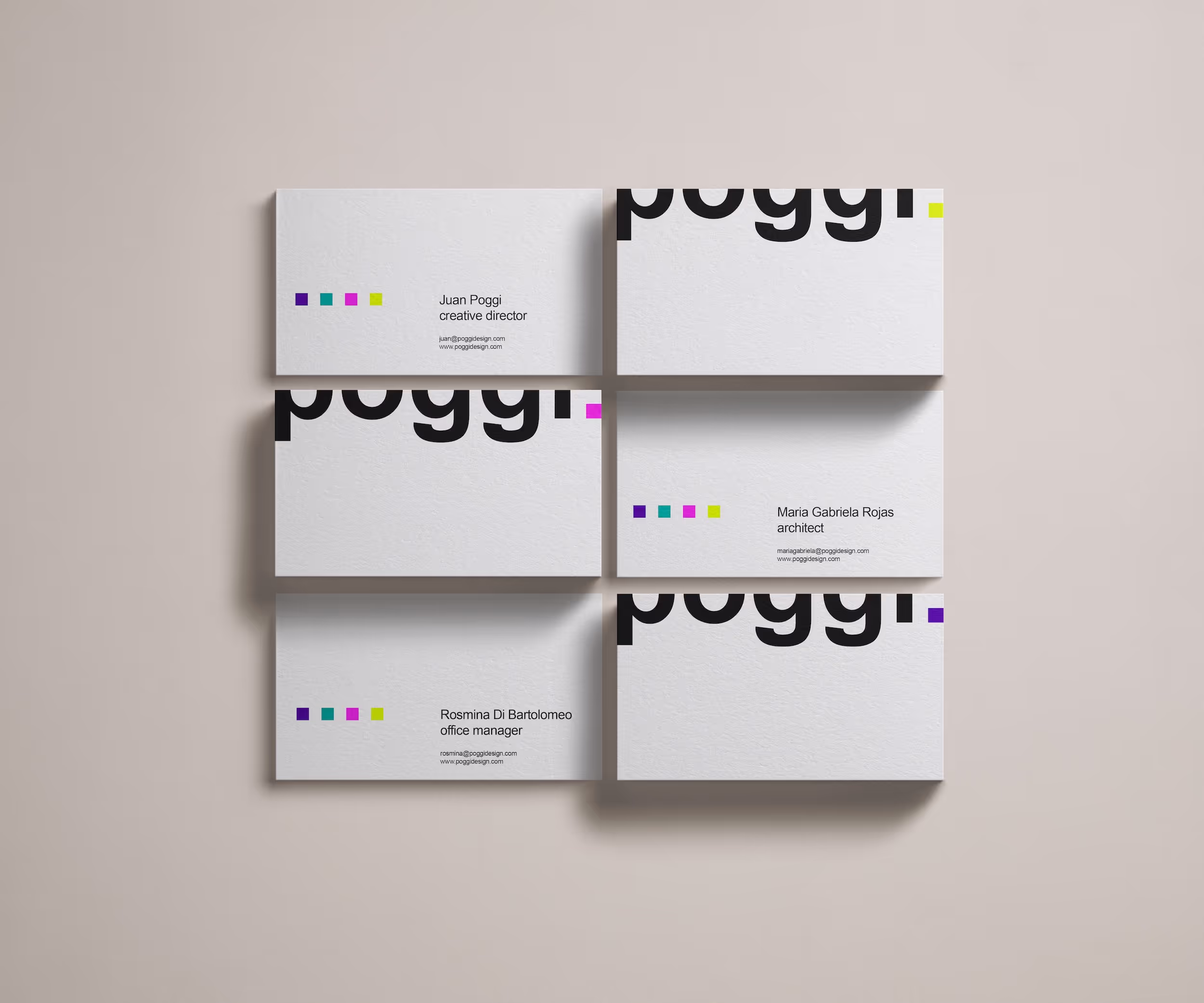
Through strategy, we uncovered that the brand and founder were inseparable—two sides of the same coin. This led to the concept “Poggi, Period”: a promise of undivided attention and commitment from the studio’s creative mastermind.
To bring this concept to life, we introduced the dot as the core graphic element, using it in grids and compositions to add energy and refinement. Vibrant accent colors were also added to the black-and-white palette, enhancing flexibility and depth without overshadowing their work.
The result? A fresh, dynamic brand that honors its roots while confidently stepping into the future.


"Studio Nika gave our branding the twist it needed while staying true to our aesthetic and personality."
"She understood our vision from the start and delivered a brand that was more that we could imagine. We couldn’t have trusted our company’s brand to anyone better, she understands the industry and knew how to perfectly capture our essence."